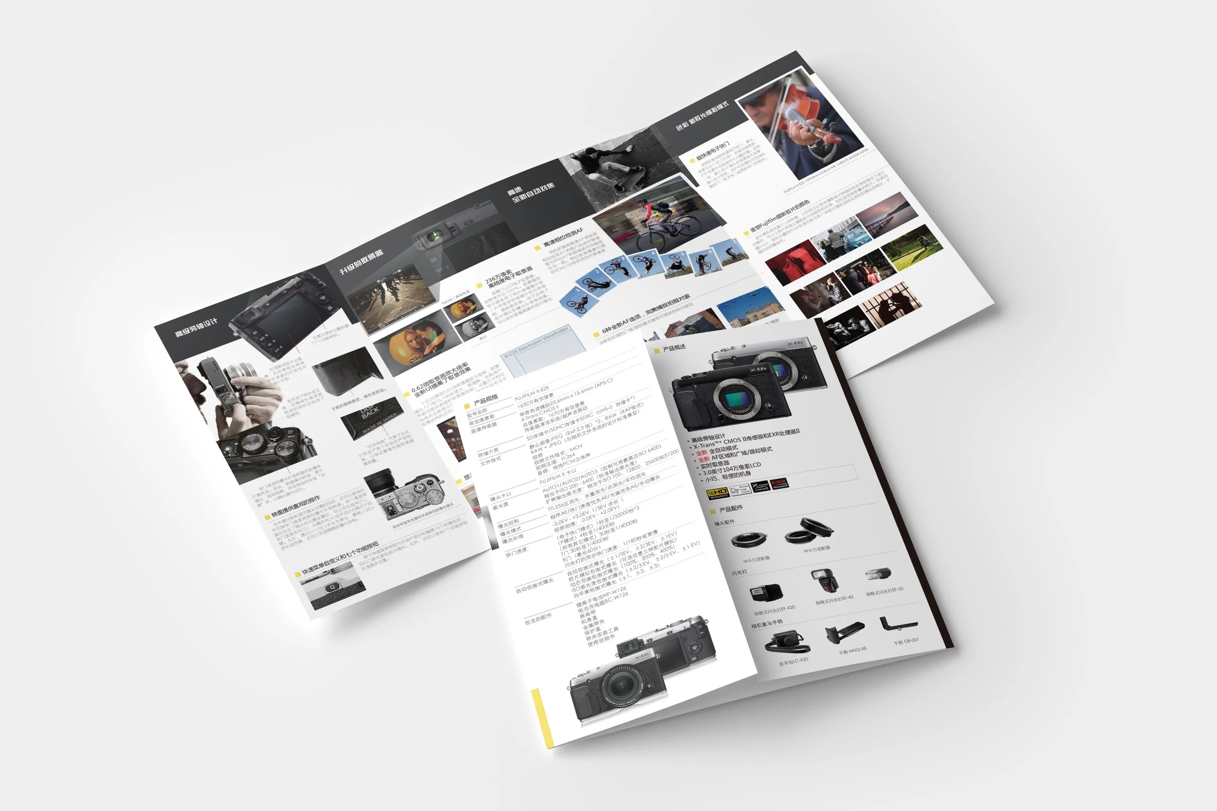
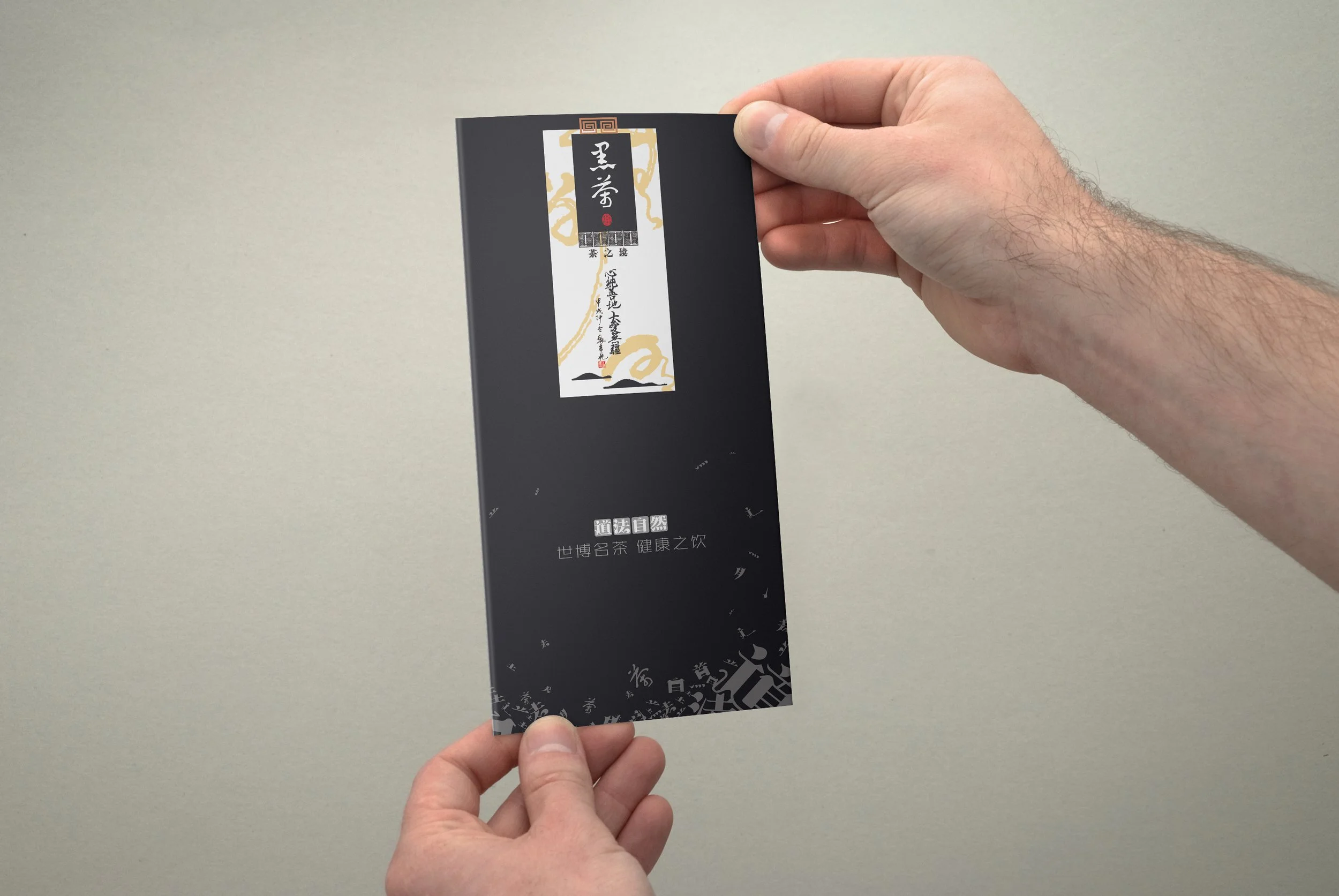
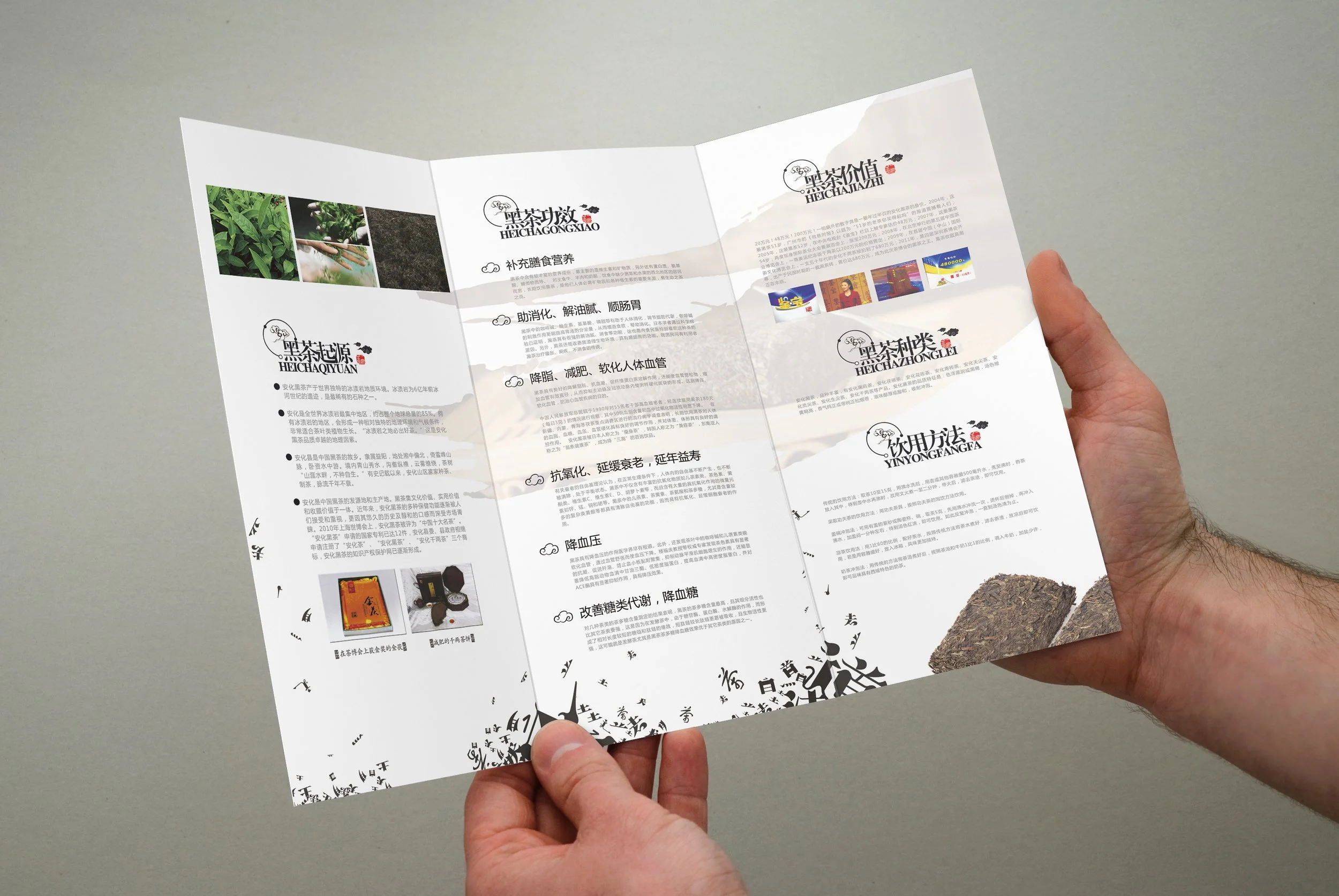
Commercial Flyer: Typography
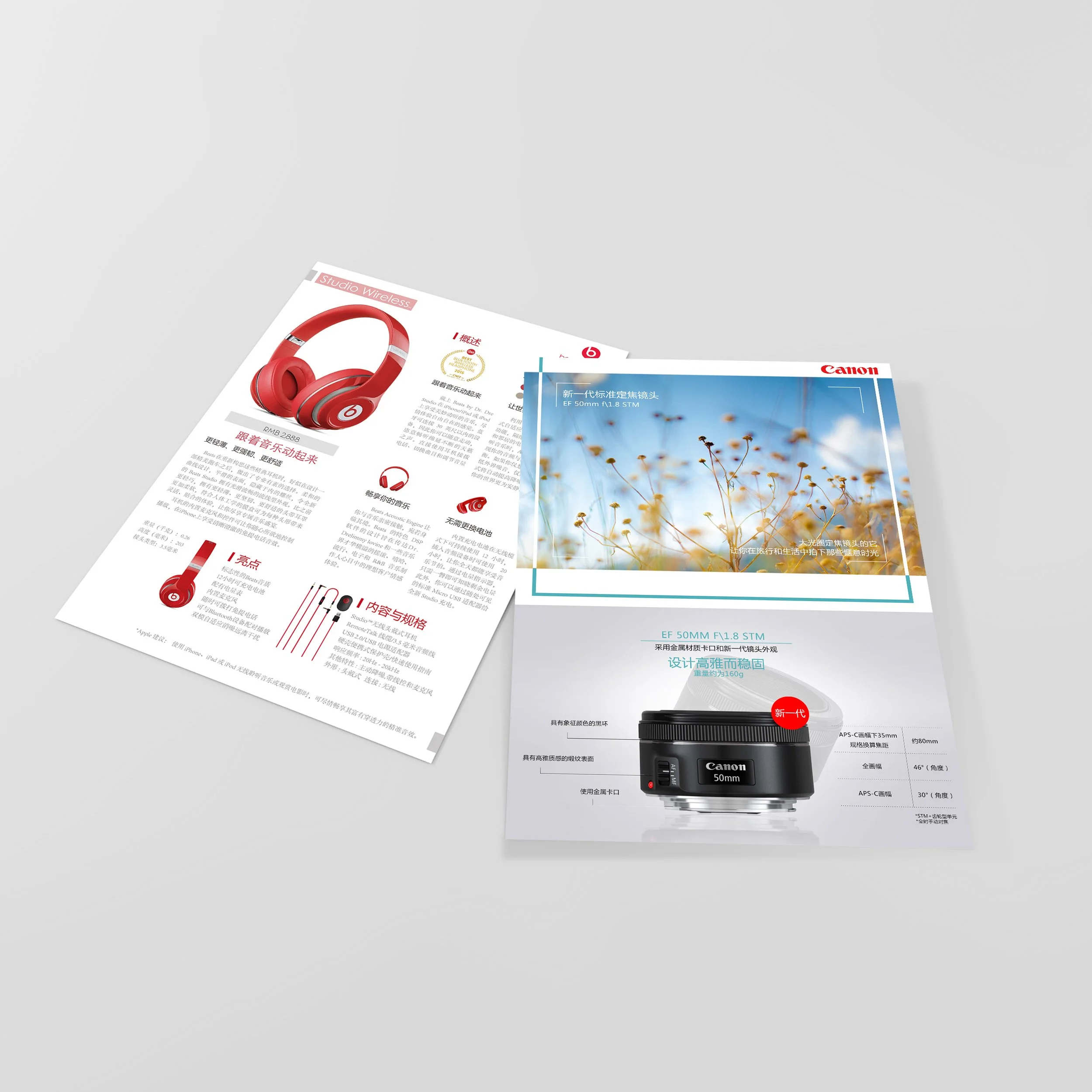
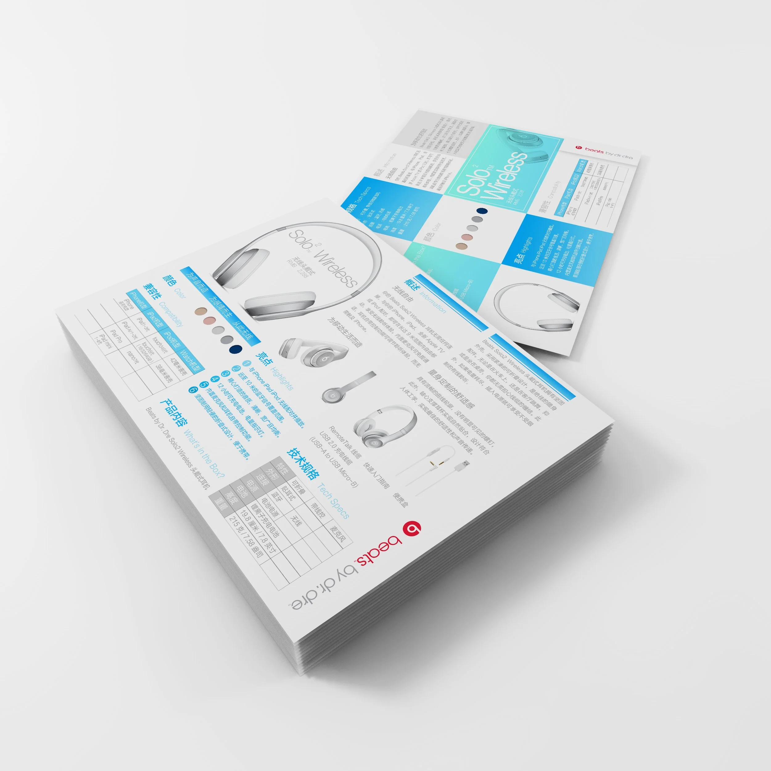
Brochures for some products like Beats, Nikon, Canon, etc. The challenge is to harmoniously integrate images and typography to create a compelling and informative experience for the reader. The goal is to create brochures that not only inform but also inspire, by showcasing the products in a visually appealing way. Through the use of striking imagery and well-crafted typography, the brochure design will bring the product to life, showcasing its unique features and capabilities.


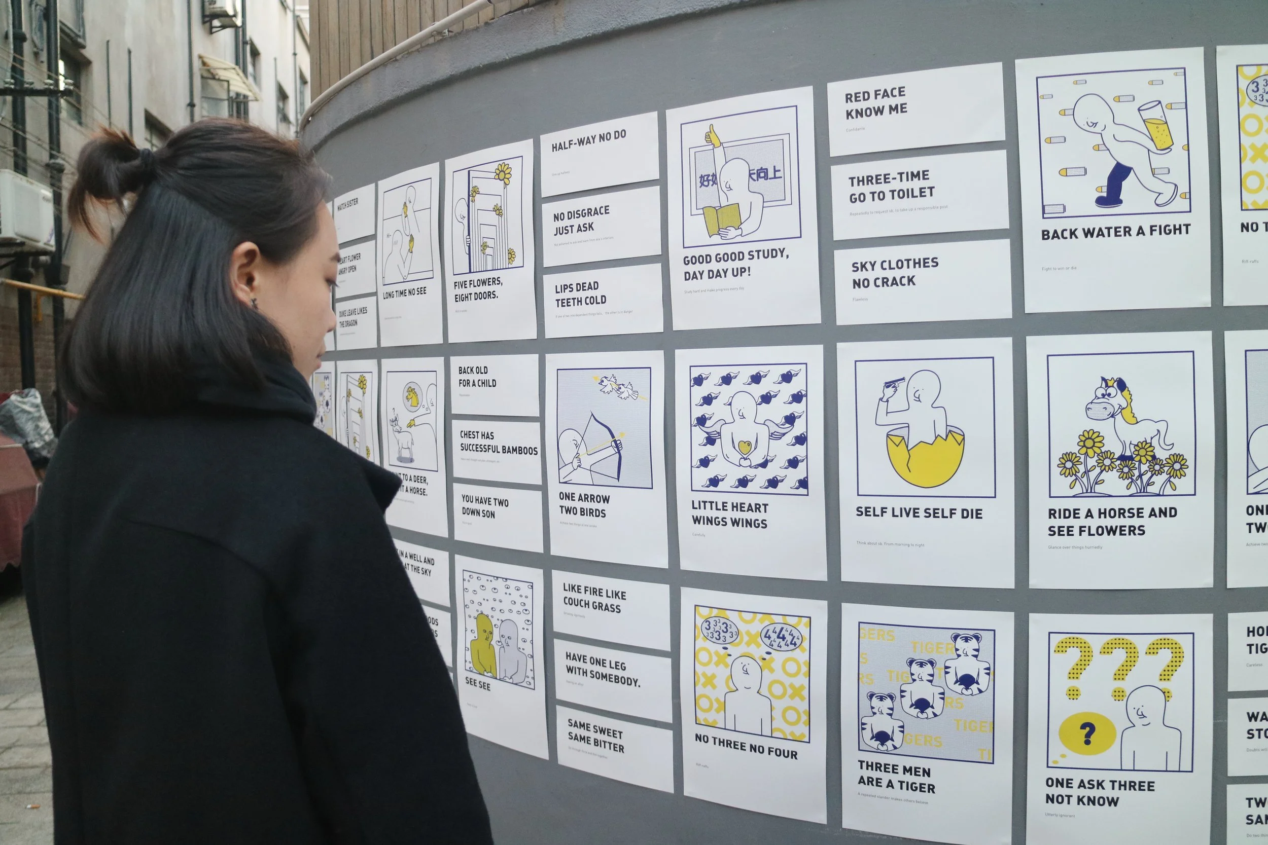
Chinglish: Visual Illustration

The inspiration for this design comes from the casual conversations between friends, who often use English translation, resulting in distorted idioms. Chinglish, a unique language phenomenon in China, has gained widespread usage and recognition. This language blends Chinese and English, often resulting in misinterpreted meanings and incorrect grammar. This project aims to showcase the interesting mistakes in Chinglish through illustrations, which will be printed on flyers and displayed in public spaces. The goal is to promote and celebrate Chinglish as a new cultural phenomenon in a lighthearted and humorous way.


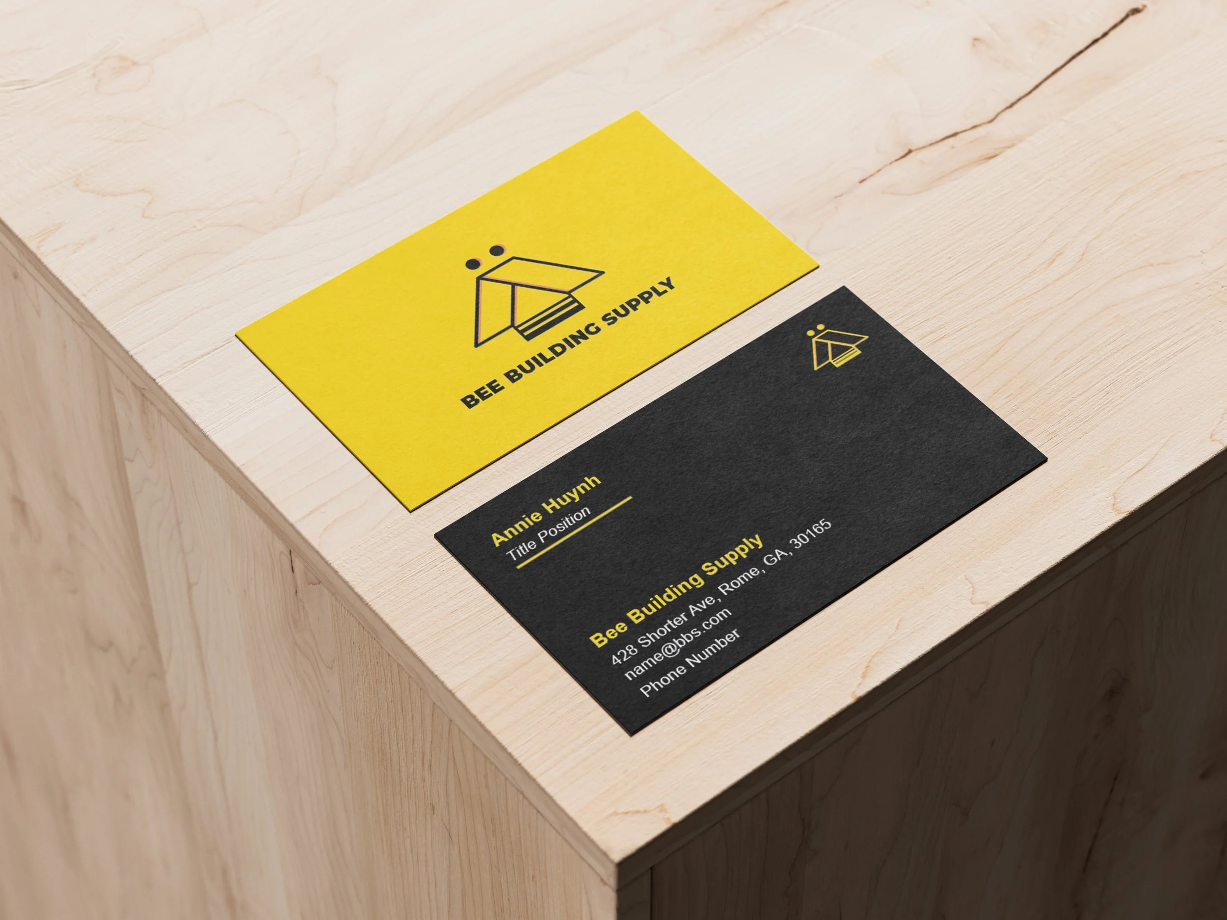
Commercial Logo& Business Card


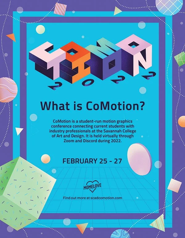
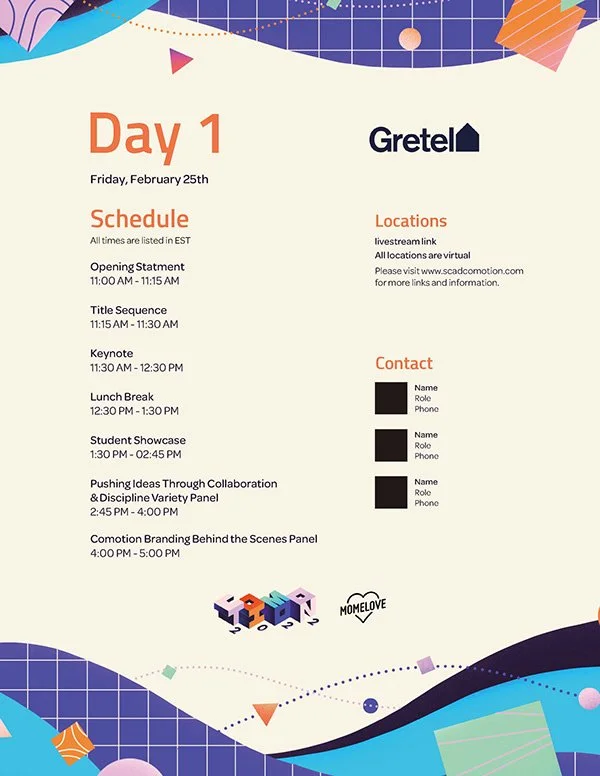
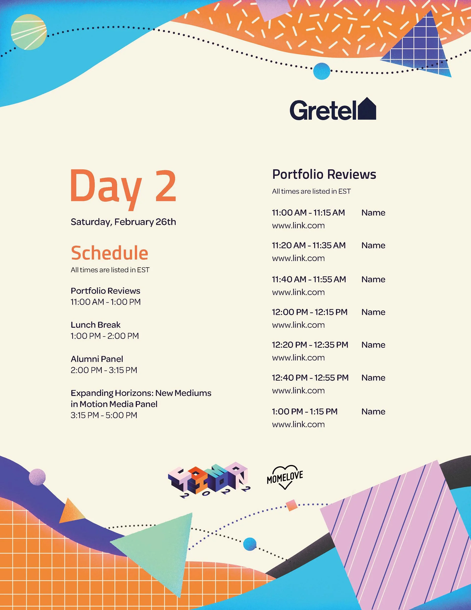
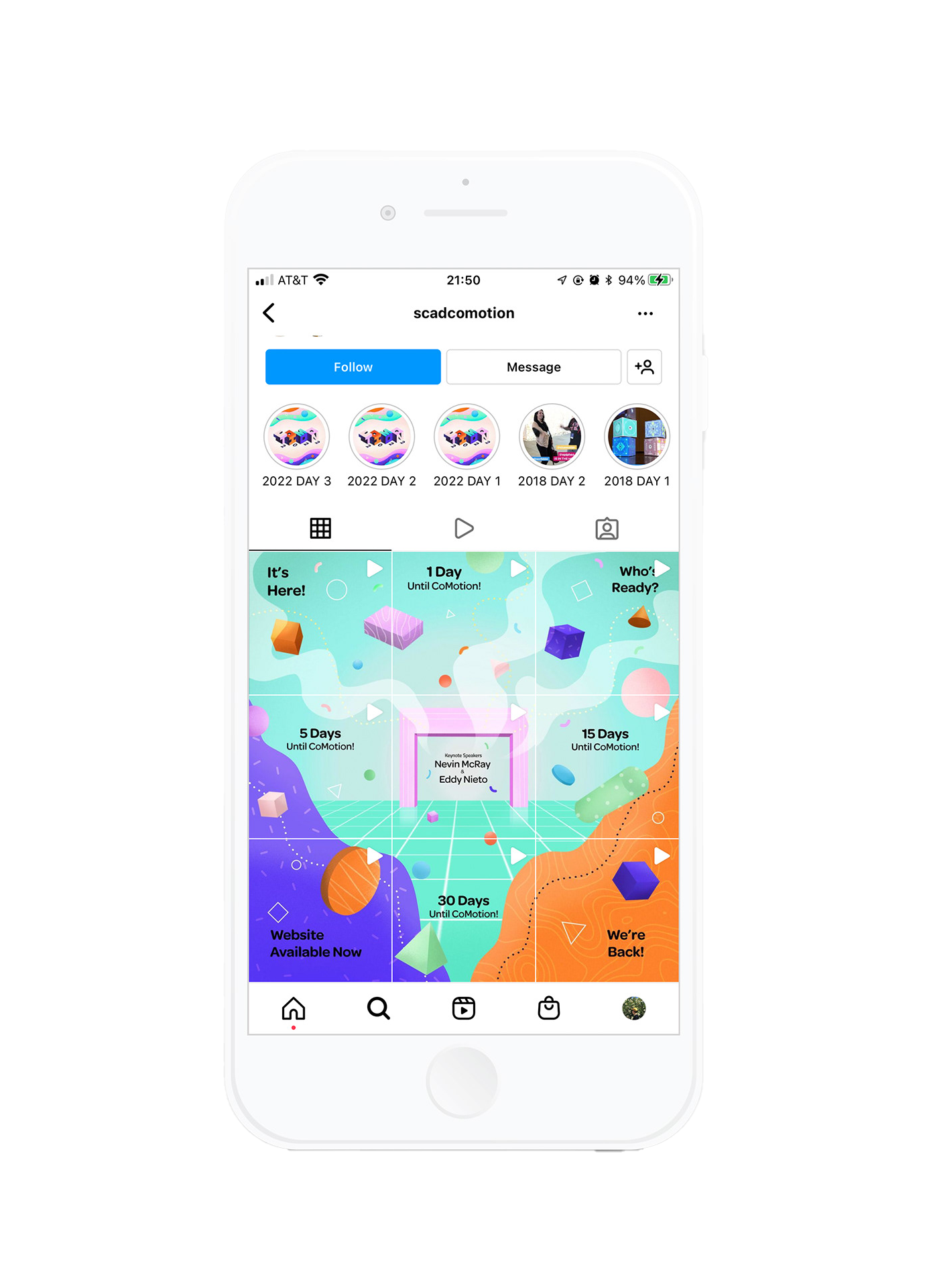
Event Guideline: GFX & Branding Identity
CoMotion is a student-led motion graphics conference at the Savannah College of Art and Design. This is the result of my work with a team of up to 30 people in 2 years, mainly responsible for logo design, typography selections, poster design, and apparel design.


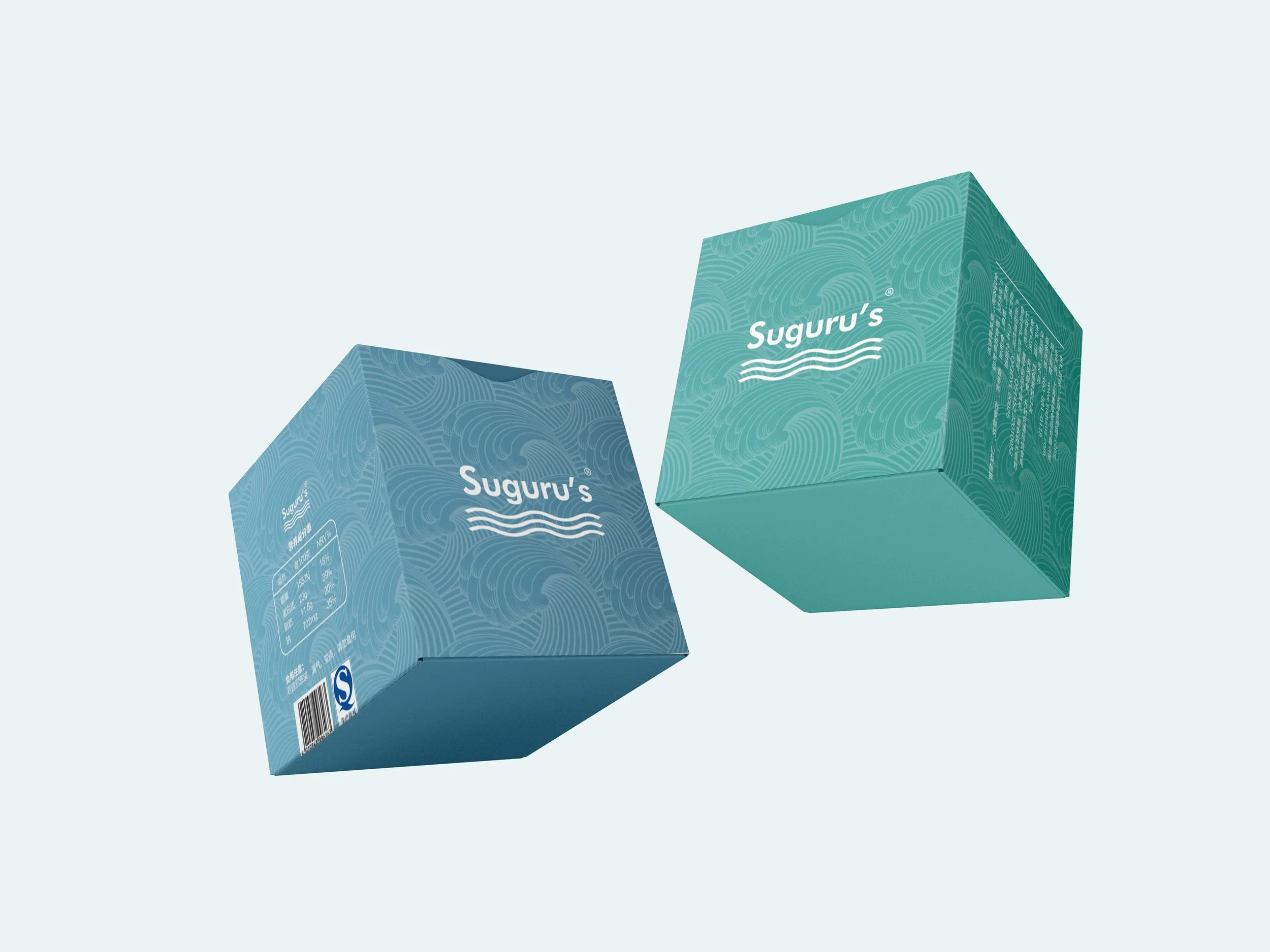
Product Design: Packaging
Suguru's is a seafood convenience food brand from Hokkaido, Japan. The packaging is based on the diversity of Japanese souvenirs, packaging materials and design style. The packaging is mainly in blue-green color, similar to the color of the sea, with a large number of sea wave graphics to make seafood snacks more relevant. The purity of the color has been reduced to reflect the quiet elegance of Japanese products.


Broadcast Design: Style Frames


Under the concept of A&E network “we are brave storytellers”. The true story behind the seemingly unexciting life. Through the use of bold color palettes, dynamic camera movements, and unique typography, I create a distinct and recognizable style for our crime stories. The goal is to captivate the audience and leave a lasting impression, elevating the genre to new heights. Whether exploring the dark underbelly of society or uncovering hidden motives, I aim to deliver a crime story that is not just informative but also visually stunning.
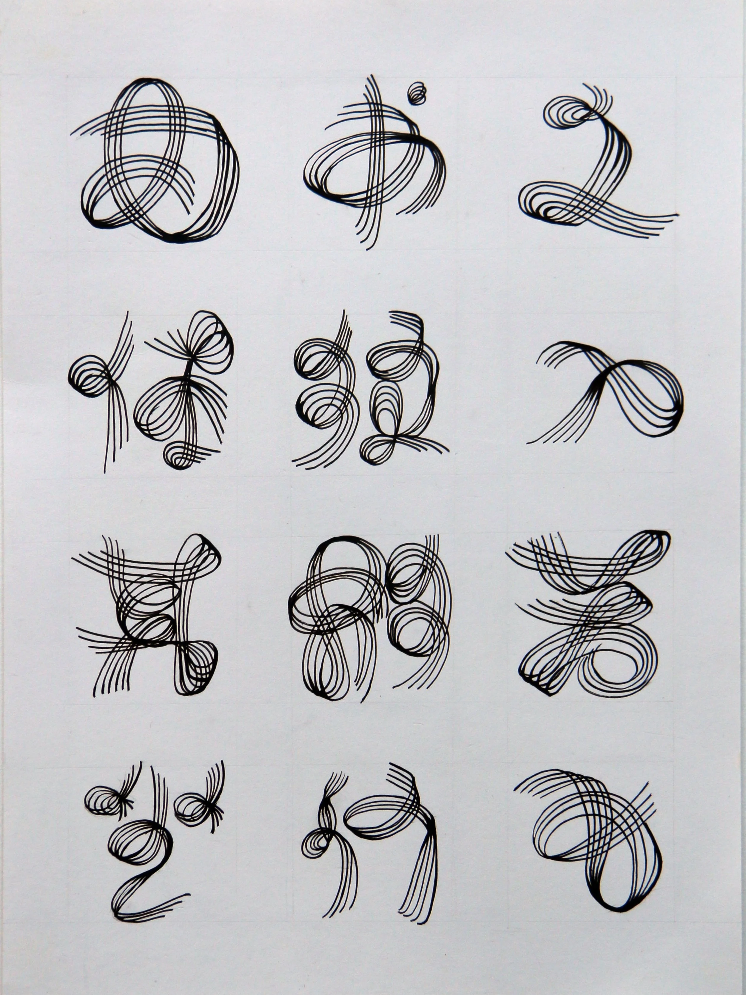
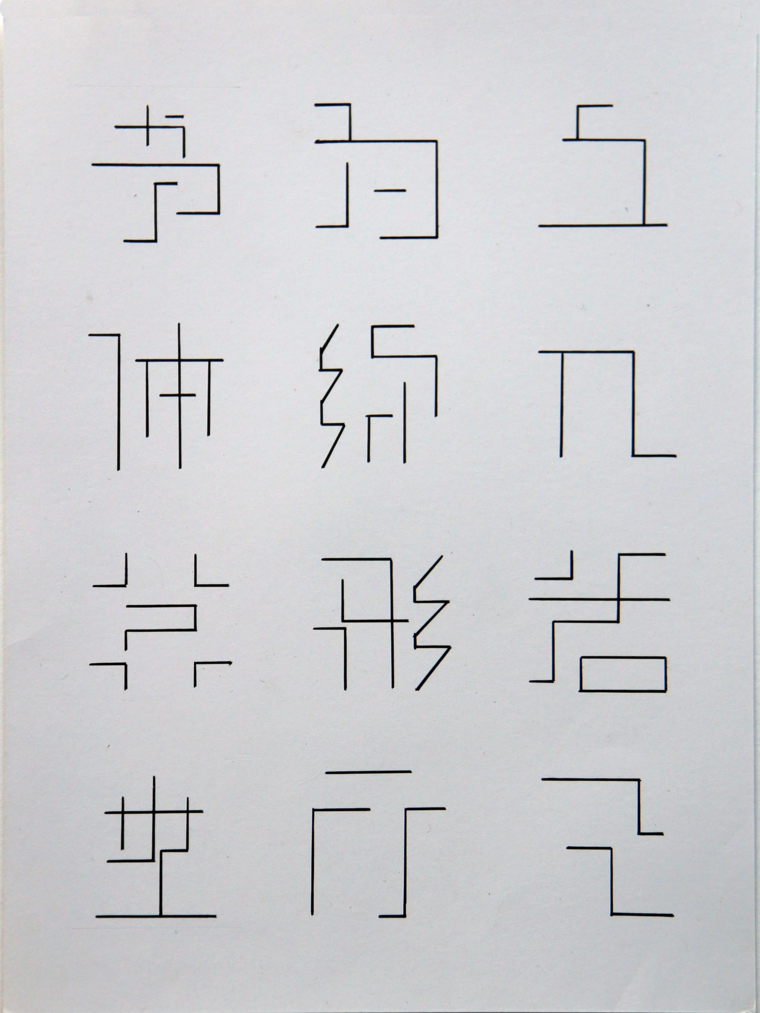
Kanji Design: Creative Fonts